
Craft Beer Packaging
One of my favorite projects!
Creating a memorable beer label starts with finding the story behind the brand. This craft beer label concept explores how illustration, typography, color, and composition can come together to create a design that stands out on the shelf. From early concepts to the final label, the Hoplet IPA project showcases the process of building a visual identity that feels unique, recognizable, and connected to the beer itself.




Winner!


The Design Process
The Hoplet is a conceptual craft beer label created for ShakesBeer Fest in Stratford, Connecticut. Inspired by Shakespeare and local community traditions, this project explores multiple label concepts before arriving at the final design. The result is a playful brand identity that brings together illustration, typography, and packaging to capture the spirit of the festival.
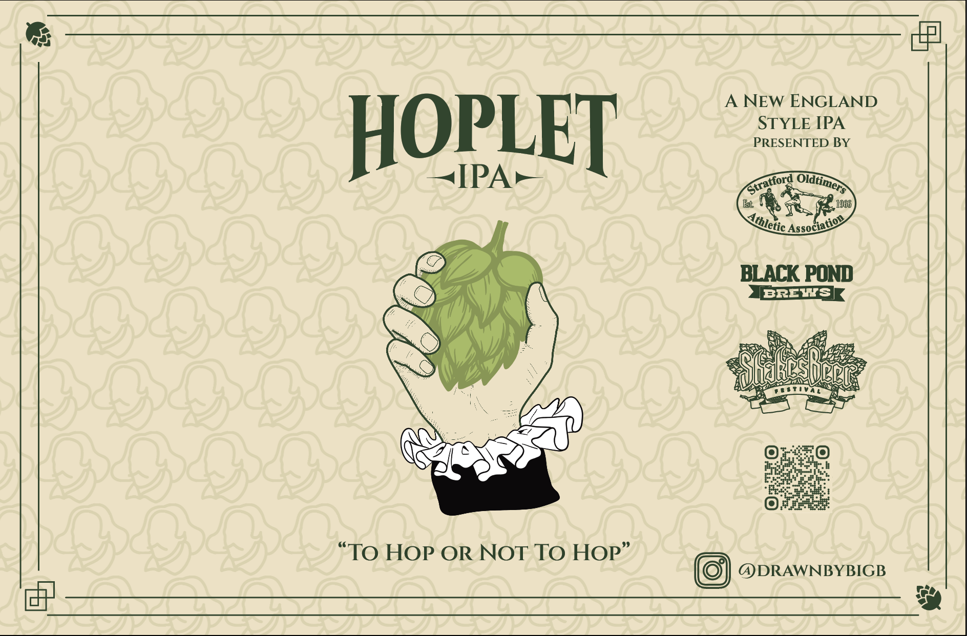
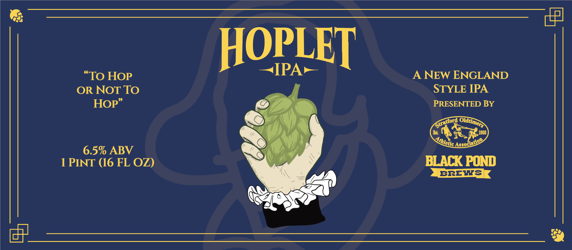
Hoplet IPA is a playful nod to Shakespeare's Hamlet, combining one of his most iconic works with the world of craft beer.
The centerpiece reimagines the famous scene by replacing the skull with a hop, creating a visual connection between Shakespeare and the festival's beer-inspired theme.
Line-art illustrations of Shakespeare are woven into the background, with multiple layouts and pattern explorations used to refine the final composition and add depth to the label.
The Playwright IPA takes its inspiration from William Shakespeare, giving the label a connection to both the festival and Stratford's rich literary history.
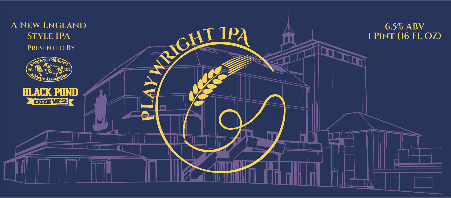
The centerpiece combines a wheat stalk with a classic quill pen, bringing together two defining elements of the project: craft beer and Shakespeare's literary legacy.
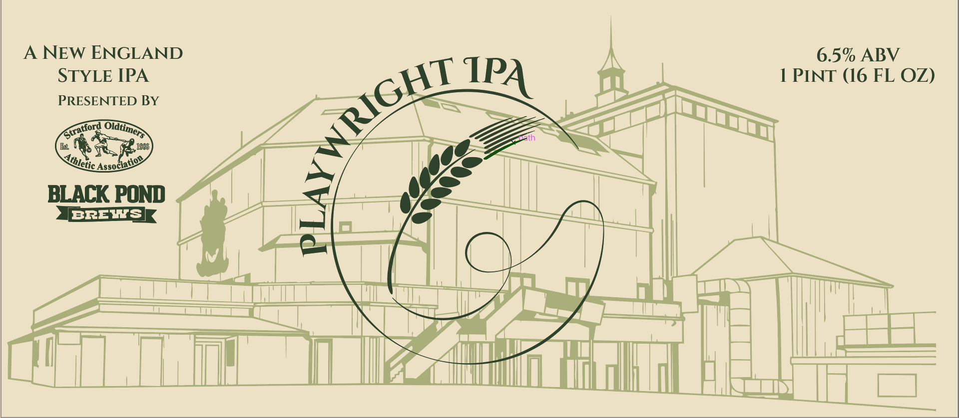
The background features a blueprint-style illustration of the historic Shakespeare Theatre in Stratford, Connecticut. While the theater was lost to a fire, the design pays tribute to an important piece of the town’s history and the legacy it left behind.
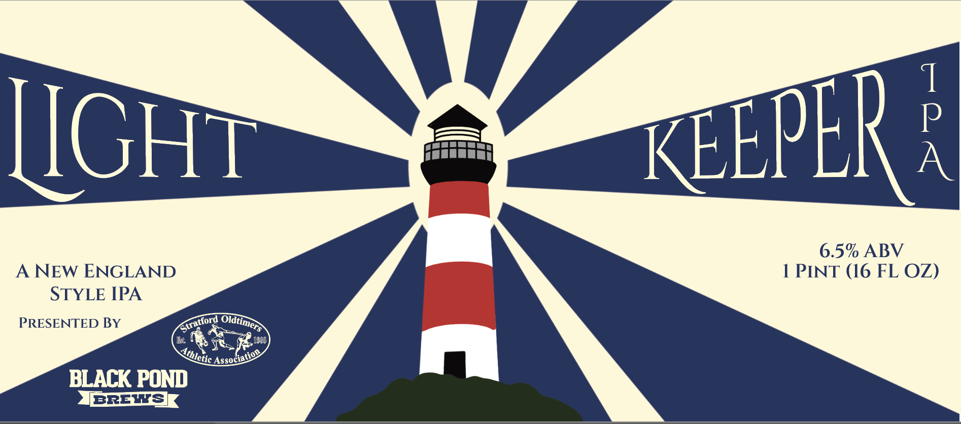
The LightKeeper IPA explores another side of Stratford’s identity, drawing inspiration from the town’s rich history beyond its connection to Shakespeare.
The label features Stratford’s historic lighthouse, a landmark that has helped define the town’s coastline for generations.
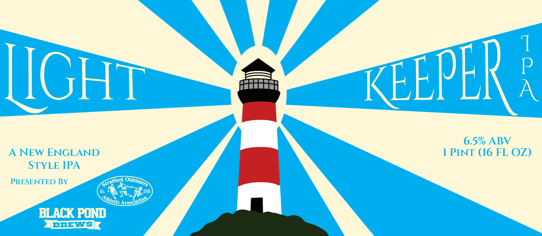
The design wraps around the can, using the lighthouse beam as a central visual element to guide the viewer through the artwork while symbolizing its role in guiding ships safely through Long Island Sound.